


Descripción
/* RESET BÁSICO SOLO DENTRO DEL MÓDULO */
.coros-product-description * {
margin: 0;
padding: 0;
box-sizing: border-box;
}
/* ==========================
LAYOUT / ANCHO GENERAL
========================== */
/* 90vw = más ancho que el contenedor del tema, pero no full */
.coros-product-description {
font-family: ‘Arial’, sans-serif;
background-color: #ffffff;
color: #000;
width: 90vw;
max-width: 90vw;
position: relative;
left: 50%;
margin-left: -45vw; /* centra el bloque de 90vw */
padding: 0;
}
/* Contenedor interno (todo lo de abajo del hero) */
.coros-product-description .container {
max-width: 1600px;
margin: 0 auto;
padding: 0 16px;
}
/* Contenido interno (secciones) centrado y alineado */
.coros-product-description section,
.coros-product-description .feature-grid-2,
.coros-product-description .feature-full,
.coros-product-description .lifestyle-row,
.coros-product-description .app-audio-section {
max-width: 1600px;
margin: 0 auto 40px auto;
padding: 0;
}
/* ==========================
TIPOGRAFÍA / COLORES
========================== */
/* TEXTOS BLANCOS SOLO DENTRO DE LAS SECCIONES OSCURAS (IMÁGENES) */
.coros-product-description .hero h1,
.coros-product-description .hero p,
.coros-product-description .feature-card h3,
.coros-product-description .feature-card p,
.coros-product-description .feature-full h3,
.coros-product-description .lifestyle-card h3,
.coros-product-description .feature-content,
.coros-product-description .feature-content *,
.coros-product-description .app-text h3,
.coros-product-description .app-text p {
color: #fff !important;
}
/* ==========================
HERO
========================== */
.coros-product-description .hero {
position: relative;
width: 100%;
height: 600px;
overflow: hidden;
}
.coros-product-description .hero img {
width: 100%;
height: 100%;
object-fit: cover;
}
.coros-product-description .hero::before {
content: »;
position: absolute;
inset: 0;
background: linear-gradient(to bottom, rgba(0,0,0,0.3), rgba(0,0,0,0.5));
z-index: 1;
}
.coros-product-description .hero-content {
position: absolute;
inset: 0;
display: flex;
flex-direction: column;
justify-content: center;
align-items: center;
text-align: center;
z-index: 2;
padding: 0 20px;
}
.coros-product-description .hero-title {
font-size: 5rem;
font-weight: bold;
letter-spacing: 5px;
margin-bottom: 30px;
text-shadow: 3px 3px 15px rgba(0,0,0,0.9);
}
.coros-product-description .hero-subtitle {
font-size: 1.3rem;
max-width: 700px;
margin: 0 auto;
line-height: 1.8;
text-shadow: 2px 2px 8px rgba(0,0,0,0.9);
text-transform: uppercase;
font-weight: 300;
}
/* ==========================
GRID 2 COLUMNAS
========================== */
.coros-product-description .feature-grid-2 {
display: grid;
grid-template-columns: 1fr 1fr;
gap: 40px;
width: 100%;
border: none;
}
/* Quitar cualquier borde gris de columnas */
.coros-product-description .feature-grid-2 > div {
border: none !important;
}
/* TARJETAS DE FEATURES */
.coros-product-description .feature-card {
position: relative;
overflow: hidden;
height: 500px;
width: 100%;
}
.coros-product-description .feature-card img,
.coros-product-description .feature-card video {
width: 100%;
height: 100%;
object-fit: cover;
}
/* Overlay oscuro */
.coros-product-description .feature-card::before {
content: »;
position: absolute;
inset: 0;
background: linear-gradient(to bottom, rgba(0,0,0,0.4), rgba(0,0,0,0.6));
z-index: 1;
}
.coros-product-description .feature-content {
position: absolute;
top: 50%;
left: 50%;
transform: translate(-50%, -50%);
text-align: center;
width: 85%;
z-index: 2;
}
.coros-product-description .feature-content h3 {
font-size: 2rem;
margin-bottom: 15px;
font-weight: bold;
letter-spacing: 2px;
text-transform: uppercase;
text-shadow: 2px 2px 10px rgba(0,0,0,0.9);
line-height: 1.3;
}
.coros-product-description .feature-content p {
font-size: 1rem;
line-height: 1.6;
text-shadow: 2px 2px 8px rgba(0,0,0,0.9);
font-weight: 300;
}
/* ==========================
FEATURE FULL
========================== */
.coros-product-description .feature-full {
width: 100%;
position: relative;
height: 500px;
overflow: hidden;
}
.coros-product-description .feature-full img {
width: 100%;
height: 100%;
object-fit: cover;
}
.coros-product-description .feature-full::before {
content: »;
position: absolute;
inset: 0;
z-index: 1;
}
/* ==========================
VIDEO
========================== */
.coros-product-description .video-container {
width: 100%;
height: 100%;
position: relative;
}
.coros-product-description .video-container video {
width: 100%;
height: 100%;
object-fit: cover;
}
/* ==========================
SECCIÓN APP + ALTAVOZ
========================== */
.coros-product-description .app-audio-section {
display: grid;
grid-template-columns: 2.2fr 1.2fr; /* App más larga, altavoz más corto */
gap: 40px;
width: 100%;
align-items: stretch;
}
/* Bloque izquierdo (App Coros) */
.coros-product-description .app-block {
position: relative;
overflow: hidden;
min-height: 420px;
background-color: #000;
color: #fff;
border-radius: 0px;
}
.coros-product-description .app-block-bg {
position: absolute;
inset: 0;
width: 100%;
height: 100%;
object-fit: cover;
opacity: 0.5; /* un poco más oscuro para que el texto se lea mejor */
}
.coros-product-description .app-block-inner {
position: relative;
z-index: 2;
display: flex;
align-items: center;
justify-content: space-between;
gap: 40px;
padding: 50px 50px;
height: 100%;
}
.coros-product-description .app-text {
max-width: 55%;
text-transform: uppercase;
}
.coros-product-description .app-text h3 {
font-size: 2.3rem;
letter-spacing: 2px;
margin-bottom: 18px;
font-weight: 800;
}
.coros-product-description .app-text p {
font-size: 1rem;
line-height: 1.6;
font-weight: 300;
text-transform: uppercase;
color: #fff !important;
text-shadow: 2px 2px 8px rgba(0,0,0,0.9);
}
.coros-product-description .app-media img {
max-width: 260px;
height: auto;
display: block;
}
/* Bloque derecho (Altavoz + Micrófono) */
.coros-product-description .audio-block {
width: 100%;
min-height: 420px;
background-image: url(«https://cdn.shopify.com/s/files/1/0578/7346/5387/files/Captura_de_pantalla_2025-11-12_185027.png?v=1762991474»);
background-size: contain;
background-repeat: no-repeat;
background-position: center;
background-color: #000;
padding: 0;
margin: 0;
border: none;
border-radius: 0px;
}
/* ==========================
LIFESTYLE ROW
========================== */
.coros-product-description .lifestyle-row {
display: grid;
grid-template-columns: 1fr 1fr;
gap: 40px;
width: 100%;
}
.coros-product-description .lifestyle-card {
position: relative;
overflow: hidden;
height: 500px;
}
.coros-product-description .lifestyle-card img {
width: 100%;
height: 100%;
object-fit: cover;
}
/* ==========================
RESPONSIVE GENERAL
========================== */
@media (max-width: 768px) {
.coros-product-description {
width: 100vw;
max-width: 100vw;
left: 50%;
margin-left: -50vw;
}
.coros-product-description .container {
max-width: 100%;
padding: 0 16px;
}
.coros-product-description .hero {
height: 400px;
}
.coros-product-description .hero-title {
font-size: 3rem;
}
.coros-product-description .hero-subtitle {
font-size: 1rem;
}
.coros-product-description .feature-grid-2,
.coros-product-description .lifestyle-row,
.coros-product-description .app-audio-section {
grid-template-columns: 1fr;
gap: 30px;
}
.coros-product-description section,
.coros-product-description .feature-full,
.coros-product-description .lifestyle-row,
.coros-product-description .app-audio-section {
margin-bottom: 30px;
}
.coros-product-description .feature-card,
.coros-product-description .feature-full,
.coros-product-description .lifestyle-card {
height: 350px;
}
.coros-product-description .feature-content h3 {
font-size: 1.5rem;
}
.coros-product-description .feature-content p {
font-size: 0.9rem;
}
/* Quitar bordes redondeados en MOBILE en todo lo importante */
.coros-product-description .app-block,
.coros-product-description .audio-block,
.coros-product-description .feature-card,
.coros-product-description .feature-full,
.coros-product-description .lifestyle-card {
border-radius: 0 !important;
}
/* APP COROS en mobile: como los otros grids, full width, texto centrado */
.coros-product-description .app-block {
min-height: 350px;
}
.coros-product-description .audio-block {
min-height: 350px;
}
.coros-product-description .app-block-inner {
flex-direction: column;
text-align: center;
padding: 30px 20px;
align-items: center;
gap: 20px;
}
.coros-product-description .app-text {
max-width: 100%;
}
.coros-product-description .app-text h3 {
font-size: 1.8rem;
}
.coros-product-description .app-text p {
font-size: 0.95rem;
}
}
/* ==========================
FAQ
========================== */
.faq-wrapper * {
margin: 0;
padding: 0;
box-sizing: border-box;
}
.faq-wrapper {
font-family: ‘Arial’, sans-serif;
background-color: #ffffff;
padding: 40px 20px;
}
.faq-wrapper .faq-container {
max-width: 900px;
margin: 0 auto;
background: white;
border-radius: 12px;
padding: 50px 40px;
box-shadow: 0 4px 20px rgba(0,0,0,0.08);
}
.faq-wrapper .faq-title {
text-align: center;
font-size: 2.5rem;
font-weight: bold;
margin-bottom: 40px;
color: #1a1a1a;
}
.faq-wrapper .faq-item {
border-bottom: 1px solid #e0e0e0;
padding: 25px 0;
cursor: pointer;
transition: all 0.3s.ease;
}
.faq-wrapper .faq-item:hover {
background-color: #fafafa;
padding-left: 10px;
padding-right: 10px;
}
.faq-wrapper .faq-question {
display: flex;
justify-content: space-between;
align-items: center;
font-size: 1.1rem;
font-weight: 600;
color: #2c2c2c;
}
.faq-wrapper .faq-icon {
width: 24px;
height: 24px;
transition: transform 0.3s ease;
flex-shrink: 0;
}
.faq-wrapper .faq-icon svg {
width: 100%;
height: 100%;
}
.faq-wrapper .faq-answer {
max-height: 0;
overflow: hidden;
transition: max-height 0.4s ease, padding 0.4s ease;
font-size: 1rem;
color: #666;
line-height: 1.7;
}
.faq-wrapper .faq-item.active .faq-answer {
max-height: 500px;
padding-top: 20px;
}
.faq-wrapper .faq-item.active .faq-icon {
transform: rotate(180deg);
}
/* Responsive FAQ */
@media (max-width: 768px) {
.faq-wrapper .faq-container {
padding: 30px 20px;
}
.faq-wrapper .faq-title {
font-size: 2rem;
}
.faq-wrapper .faq-question {
font-size: 1rem;
}
.faq-wrapper .faq-answer {
font-size: 0.95rem;
}
}
/* ==========================
AJUSTE IMAGEN FEATURE FULL EN TABLET
========================== */
@media (max-width: 1024px) {
/* Evitar zoom en la imagen */
.coros-product-description .feature-full img {
content: url(«https://cdn.shopify.com/s/files/1/0578/7346/5387/files/Captura_de_pantalla_2025-11-13_082630.png?v=1763040508») !important;
object-fit: contain !important;
width: 100% !important;
height: auto !important;
}
/* Ajustar contenedor para que no recorte la imagen */
.coros-product-description .feature-full {
height: auto !important;
padding: 0;
}
}

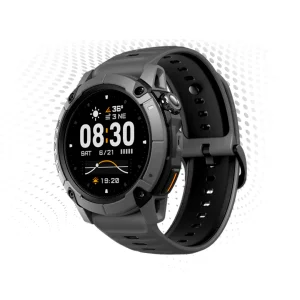
COROS
APEX 4
El reloj de montaña más innovador para entrenar, competir y superar tus marcas personales.

APP COROS:
DONDE VIVE TU AVENTURA
Planifica y realiza un seguimiento mientras revives cada recuerdo, estadística y cumbre en un solo lugar.

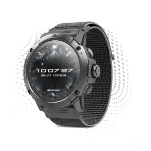
Ingeniería de alto Nivel
Titanio ligero, enchaces reforzados,
pantalla táctil de zafiro.

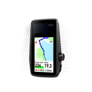
Mapas más detallados
Mapas globales con nombres de senderos y calles,
puntos de interés y navegación giro a giro.

Vuelo sobre la actividad en 3D
Estudia cada paso.

Datos precisos,
en todo momento.
Sistemas GNSS Multi-Frecuencia
Barómetro de doble escala
Algoritmos GPS mejorados


Valoraciones
No hay valoraciones aún.